We often do stratified analyses, in which we wish to show hazard ratios, or odds ratios, and their confidence intervals graphically, stratified across levels of a variable. For example, we might be interested in whether Drug A is better than Drug B at preventing some outcome, and whether the magnitude of that effect differs across sexes, race groups, or patients who have/do not have some comorbidity.
This labdoc focuses on creating the figure to display such analyses. We’ll discuss running the analyses that underly such a figure elsewhere (to come). There are several packages that can create forest plots, but this one – forestploter – is pretty easy/straightforward and customizable.
First, let’s load the relevant libraries and create some data.
library(tidyverse) # for data wranglinglibrary(forestploter) # for the forest plotlibrary(knitr) # for kable() to print a nice tablelibrary(grid) # grid and gridExtra to glue a couple plots togetherlibrary(gridExtra)# some summary data calculated elsewheremace <-tribble(~Subgroup, ~est, ~low.ci, ~high.ci, ~p.interaction,# Subgroup, point estimate, low end of 95% CI, high end of 95% CI, p-value for interaction"History of ESA use", NA, NA, NA, 0.745,"No", 1.00, 0.86, 1.16, NA,"Yes", 0.97, 0.92, 1.02, NA,"Race", NA, NA, NA, 0.203,"White", 1.01, 0.95, 1.07, NA,"Black", 0.89, 0.80, 0.99, NA,"Others", 0.99, 0.79, 1.23, NA,"Age group", NA, NA, NA, 0.244,"18 to 64 y", 0.93, 0.85, 1.02, NA,"65 and above", 0.99, 0.91, 1.05, NA,"Sex", NA, NA, NA, 0.664,"Female", 0.96, 0.89, 1.04, NA,"Male", 0.98, 0.92, 1.06, NA )# print the tablekable(mace)
Subgroup
est
low.ci
high.ci
p.interaction
History of ESA use
NA
NA
NA
0.745
No
1.00
0.86
1.16
NA
Yes
0.97
0.92
1.02
NA
Race
NA
NA
NA
0.203
White
1.01
0.95
1.07
NA
Black
0.89
0.80
0.99
NA
Others
0.99
0.79
1.23
NA
Age group
NA
NA
NA
0.244
18 to 64 y
0.93
0.85
1.02
NA
65 and above
0.99
0.91
1.05
NA
Sex
NA
NA
NA
0.664
Female
0.96
0.89
1.04
NA
Male
0.98
0.92
1.06
NA
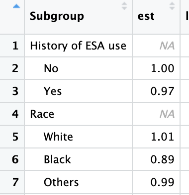
The above table is the summary data from the stratified analyses. Stratification variables are supplied as their own line, with several NA values and, finally, the p-value for the interaction test. The levels of the stratification variable have more information, including the value of the level, the point estimate, and the lower and upper confidence intervals.
Next, we will do a few data edits to prepare for the forest plot.
mace <- mace |>mutate(# indent levels of the strata (subgroup), but not the name of the strataSubgroup =if_else(is.na(est), Subgroup, paste0(" ", Subgroup)),# create a standard error value to size the box of the forest plotse = (log(high.ci) -log(est))/1.96,# create a space for the actual plot - you may need to adjust the # (30) here ``=paste(rep(" ", 30), collapse =" "),# glue together a HR (95% CI) for display`HR (95% CI)`=if_else(is.na(se), "", sprintf("%.2f (%.2f - %.2f)", est, low.ci, high.ci)),# rename p-interaction, and convert to string (may also want to use sprintf() function if needed)`p-interaction`=if_else(is.na(p.interaction), "", paste(p.interaction))) |># get rid of the old p.interaction variable, as we no longer need it. select(-p.interaction)kable(mace)
Subgroup
est
low.ci
high.ci
se
HR (95% CI)
p-interaction
History of ESA use
NA
NA
NA
NA
0.745
No
1.00
0.86
1.16
0.0757245
1.00 (0.86 - 1.16)
Yes
0.97
0.92
1.02
0.0256438
0.97 (0.92 - 1.02)
Race
NA
NA
NA
NA
0.203
White
1.01
0.95
1.07
0.0294430
1.01 (0.95 - 1.07)
Black
0.89
0.80
0.99
0.0543283
0.89 (0.80 - 0.99)
Others
0.99
0.79
1.23
0.1107472
0.99 (0.79 - 1.23)
Age group
NA
NA
NA
NA
0.244
18 to 64 y
0.93
0.85
1.02
0.0471292
0.93 (0.85 - 1.02)
65 and above
0.99
0.91
1.05
0.0300207
0.99 (0.91 - 1.05)
Sex
NA
NA
NA
NA
0.664
Female
0.96
0.89
1.04
0.0408381
0.96 (0.89 - 1.04)
Male
0.98
0.92
1.06
0.0400365
0.98 (0.92 - 1.06)
As you can see by comparing this table to the first one above, the code above just cleans up the data a bit and gets it ready for display. One thing that’s not obvious from the output table is that the levels within each strata (for example, Male and Female) are indented. If you opened the table with View(mace) you would see this:
This indentation is necessary if you want the eventual forest plot to have the same indentation for each level of a strata. If you don’t care (or don’t even want strata headers), you could omit the step that creates this indentation.
You may need to adjust the above code to get your forest plot just right. One thing to note: the variable names will be the headers in the figure. So if you want something, for example, that includes spaces, you need to name the variable with `’s around it (see, for example, the HR (95% CI) variable I created above).
Next, we create the theme. There’s lots of options here. Run ??forestploter::forest_theme in your Console to see the options.
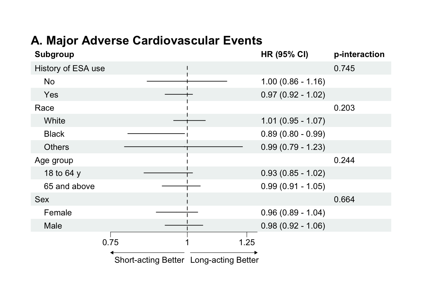
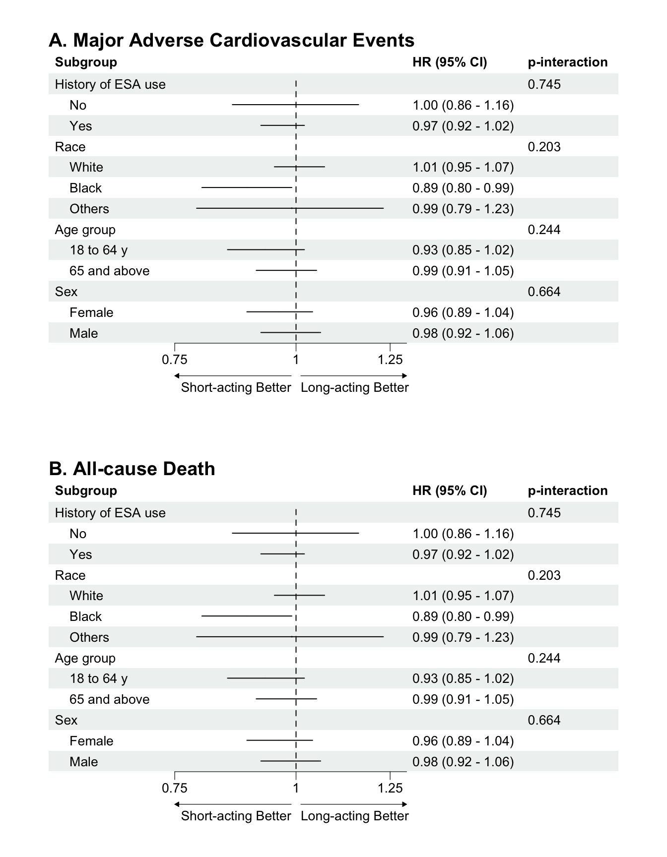
And, finally, we create the plot and plot it. Note that the first line, forest(mace[,c(1, 6:8)]) selects the specific columns (1, 6, 7, and 8) we’re going to include. ci_column specifies where to put the actual forest plot, numbered as columns from the first (left-most).
If you want to save the file, you can use the base R approach, by plotting the above, getting it to look just how you want it by adjusting spacing, or other options, then running dev.copy() and dev.off(). Another option is to arrange them in a grob, which you can then save w/ ggsave().
# base R approach, once the panel (or individual plot) has been plotted in your Viewer# Note this would saving as svg, but you could instead use other options: pdf, png, jpg, etc..dev.copy(svg, "path_to_location/filename.svg")dev.off()# grob approachg <-arrangeGrob(p, p2, nrow=2) ggsave(file ="path_to_location/filename.svg", g,device ="svg",width =7,height =8.5,units ="in")